Remembering chilhood – Dragon Ball Pencil Drawings
When I was a kid, I could spent hours and hours drawing characters from Dragon Ball, to do so again brings me a lot of good memories!
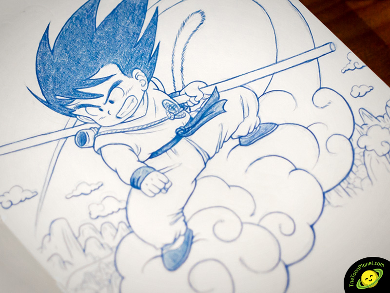

When I was a kid, I could spent hours and hours drawing characters from Dragon Ball, to do so again brings me a lot of good memories!
Last Days of Eden sent us a photo of their drums for tonight show with UDO in Avilés. The logo we designed some months ago looks impressive in the bass drum! Listen to them in www.lastdaysofeden.es


Cloud Strife from Final Fantasy VII Fan-Art pencil drawing


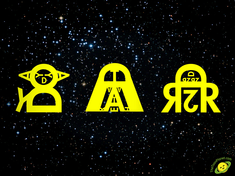
Some tipography experiments creating new caligram designs! Try to guess who are these characters from a famous film saga!
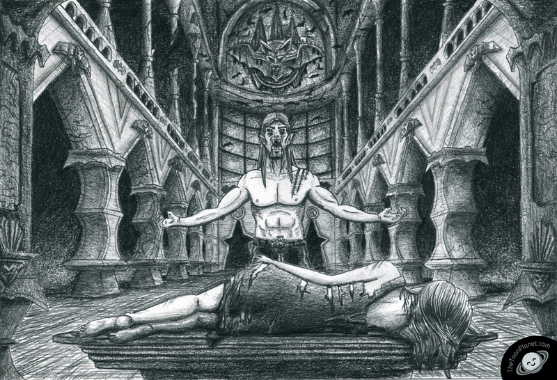
En este tutorial de dibujo, verás los pasos que se siguen para realizar una ilustración compleja a lápiz, desde el primer boceto, hasta el retoque digital final en adobe Photoshop CS6.
Partimos de un enunciado que nos pide realizar la ilustración de un vampiro y una chica ambientada en un castillo abandonado. Lo primero de todo es realizar varias pruebas y bocetos para encontrar una composición que nos guste y sea sugerente. Una vez tenemos más o menos claro donde irá cada elemento, es hora de buscar algunas imágenes que nos sirvan referencia para enriquecer nuestro lenguaje visual relacionado con la temática que estamos tratando. Este es el boceto final que elegí, como podéis ver, sólo hice la mitad del fondo ya que la otra mitad era igual.

Una vez tenemos el boceto acabado, es hora de pasar a nuestro dibujo final. Empezamos marcando las lineas y formas de manera suave con un lápiz duro 4H o similar.

Ahora que ya tenemos dibujado suavemente las referencias de los elementos dibujamos los trazos finales con un lápiz más blando (HB o similar) y marcándolos más.

Con un lápiz muy blando (3B o similar) procedemos a rellenar las zonas más oscuras de la ilustración. La mejor forma de hacer esto es dar varias capas de lápiz de forma que quede una textura uniforme y no se noten los trazos. Os aconsejo que dibujéis con otra hoja entre vuestro dibujo y mano, ya que sino lo mancharéis todo al apoyaros sobre el grafito.

Ahora toca rellenar con sombras más tenúes los personajes y su entorno. Para esto es bueno que vayais combinando los 3 lápices que hemos utilizado hasta ahora, ya que necesitaréis un rango de tonos de gris mayor para sugerir bien el volumen de los elementos. Con sólo un tipo de lápiz os quedaría o demasiado claro u oscuro, dependiendo de la dureza de este. Al igual que en el paso anterior es importante ir trabajando sobre capas a la vez sobre todo el dibujo, así evitaréis que la luz este equilibrada en toda la ilustración.

Añadimos algunos detalles extras al fondo, como algunos murciélagos y grietas en las columnas, de forma que den un ambiente más tétrico a la imagen
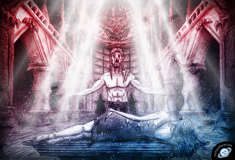
Escaneamos la imagen a 600dpi para tenerla digitalizada a gran calidad. En Adobe CS6 podemos aplicar varios efectos de luz para hacer que la ilustración tenga un gran impacto. Aplicamos a toda la imagen una superposición de degradado con modo de fusión superponer, también añadimos un efecto de sombra interior para oscurecer un poco los extremos. Finalmente utilizamos varios degradados reflejados y los atenuamos con máscaras de capa para crear la ilusión de rayos de luz (Al igual que antes probamos varios modos de fusión de esas capas y cambiamos valores de opacidad). Por último, personalizamos un pincel cambiando los parámetros de dispersión y espaciado para hacer como si fueran motas de polvo en suspensión, luego les aplicamos un resplandor exterior tenue.
66KBDDY7U9M5
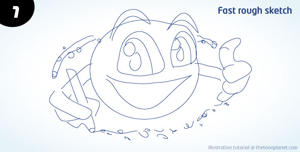
In this tutorial I will explain and show you my process of how to create a cute planet cartoon character from a sketch in 9 easy steps with Adobe Illustrator. Here you will learn some tips about the usage of width tool, live paint, digital inking and refined sketching applied to the creation of cartoon characters. The techniques described below are part of my usual process of design, but you can take them as a reference to help you to improve your working process, applying them to your own style of illustration.
In the initial stage I drew a fast rough sketch to place the basic proportions and shapes of the character. I usually draw the sketch with a pencil and papel and then scan it but this time I did it directly with the wacom tablet in Illustrator. I would recommend to try both posibilities and see which fits better your style, in my case, I prefer drawing pencil because I can draw in a natural way fastly.
If you have a really initial good sketch you can avoid this step, but It will help you to construct better shapes and lines. You can set your actual layer as “template” for the rough sketch in options and create a new one for the final lines drawing over the previous strokes.

In the third stage, I make the definitive lines and strokes, so I draw carefully with the pen tool or with my wacom tablet and drawscribe plugin. Don’t feel bad for using basic shape tools for making circles or rectangles if you need them, you will gain a lot of time for paying attention to other details.

I have to delete some lines and set a wider stroke to all lines so I can see them better for the next step and for giving more visual power to the character.

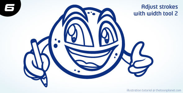
In the next two steps I use the illustrator width tool which helps me a lot in the digital inking process. Instead of using the normal pen tool and making all the shapes of the contour, I can modify the width of the strokes wherever I want.

Take into account that outer strokes are wider than inner strokes, and detail strokes are the thinnest.
Now, It’s time to use live paint, a tool which may help you coloring your character very fast. When you have filled all the color, you can emphasize the outer stroke a little more by adding a new one around all the character.

I think eyes and mouth are drawing attention too much, so I decide to change them with a softer color and to delete the contour of the eyes.

Finally, I change the basic color palette of the character into interesting gradients. Radial ones will help you to create shadow and light areas giving volume to the character, so I try this till I get a good result.

Put the characer over a background and add a thin outer white line and you will get an awesome cute cartoon planet!

Good news everyone! Today I launch TheToonPlanet’s website. It is not finished yet but I am hard-working on it while google is indexing our pages and keywords. I will be designing this site for a few weeks so you will be able to see some progress and new work on my portfolio section during next days. Hope you like it :)